
What’s in a brand? Surely if you like something you simply buy it. Maybe so, but what makes you want to select it in the first place, and often remain loyal?
According to research by Nielssen and Meijers in 2011, overt displays of high-end consumer consumption promote positive behaviour in social interactions. Field research showed overwhelmingly that the same person dressed in designer gear as opposed to non-branded attire was far more likely to be engaged with in an encouraging manner. A fall whilst out jogging in my black plimsolls would yield a wide birth from others as opposed to the offer of a blood transfusion if I were wearing my Christian Louboutin Spike Sock Donna sneakers (not that I actually own a pair).
As speedway strives to attract a new generation of followers whilst holding onto its core support, I pondered this issue with the help of Amelia Sharples, designer at Müller, one of the largest global food suppliers, where imagery plays a significant part in drawing the eye and maintaining customer allegiance. Could speedway learn from the power of branding, and was there any relationship between the halcyon days of the sport and the club body colours our heroes wore then?
Selecting my all-time top seven most iconic emblems ever to grace the shale, I’ve ranked them, alongside a potted history of their club adoption and sought Amelia’s expert review on the potential commercial pull.
1. Oxford Cheetahs
Brash, powerful, and direct, the Cheetahs came into being in the late forties after a competition hosted by The Oxford Mail. Engaging with the ‘speed’ in speedway the many incarnations typify the spirit of elegance and domination. Class personified.
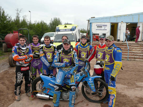
Amelia: The Cheetahs branding is vivid and dynamic, demanding the eyes attention. Although colour semiotics are subjective and dependent on context, they have chosen colours typically associated with luxury, power, and wealth. Purple connects with opulence deriving from the scarcity of the pigment in ancient times, whilst the yellow denotes connotations of gold. Cadbury most famously uses this combination. The Cheetah graphic ties the branding together, being consistent with the name of the team – uniformity across all levels of branding is a key element to success.
2. Cradley Heath Heathens
“Ommer Um Cradley!” was brilliantly captured in this image of brute force, born out of hard labour, perseverance, and pride. Who wouldn’t want to be an all-conquering Heathen? Certainly, the list of world champions and top-class performers only edified this class act.
Alliteration at its most sublime and infinitely more memorable than the once held, and rather bland, ‘United’.

Amelia: To achieve a strong logo, a key attribute is that it should be recognisable and memorable. The Heathens logo most certainly achieves this. The unusual graphic is impactive, thanks to the limited yet bold colour palette. Although on a commercial level I would consider this design to be an acquired taste – the visual is very aggressive which is intensified by excessive use of red in anomalous places. A colour which can convey connotations of danger, anger and has even been claimed to have the potential of raising a person’s blood pressure.
3. Hull Vikings
Nomadic, defiant, and as hard as nails. The enduring symbol of Hull was a composite of light and dark that was always a visible threat on track, even when the conditions were dire. Odin, Thor, Loki, and the other Viking Gods bowed to the most awe-inspiring brand – with it being more than a rumour that the don of speedway promotors, the dear departed Ian Thomas, was behind the introduction of the logo, thankfully replacing the “Angels.”

Amelia: This branding is lacking personality and individuality. In comparison to the other teams, the colours are subtle and dull. The visual is a literal depiction of the term ‘Viking’ and its stencil print design style isn’t far off that of which you find on clipart. On the other hand, the combination of the royal blue with the black alongside the understated logo makes for a very wearable brand for mass consumers.
4. White City Rebels
Rightly a contentious contemporary symbol, the associated nickname nevertheless gave an air of insurrection. Retained after the Oxford promotion moved to the capital, the 1978 design incorporated a bucking confederate soldier on a bike. A busy looking example, but distinctive and daring.
The late, great, Dave Lanning had more than a guiding hand in the choice of the new nickname and the original body-colour design in his days as general manager at Oxford.

Amelia: The Rebels branding is a classic retro style. The composition of the design with the proportionate use of red, white, and blue alongside the diagonally organised star shapes strongly evokes American vibes reminiscent of Evel Knievel, the renowned stunt artist’s costume. The bold stencil style font furthers the stateside trend which can be assimilated in the typography seen on the action film, ‘The A-Team’.
This style feels very sporty, perhaps due to the colour selection – red, white, and blue being a popular across team kits and being the most commonly occurring colours across national flags.
5. Poole Pirates
Swashbuckling, certain, and constant. Simple, no-nonsense with a clear desire – we are here to plunder! The embodiment of a ruthless ambition that has reflected the on-track success of this famous club.
Perhaps alliteration again, although I fancy the proximity to the sea has much to do with the choice of trademark.

Amelia: This branding is timeless. The graphic is unfussy and minimalist with thick linework to create impact and visibility from afar. A feature of a great logo is that it is effective in black and white, and this design is most certainly that.
6. Newcastle Diamonds
Strength and elegance majestically captured in this pure statement of purpose. In the late 1970s this was transferred into utter dominance of the second tier of league racing, and a visit from the Diamonds always added bums on seats.
From 1938 onwards, save the 1949 season when they were the Magpies, the Byker boys have been known as the Diamonds, although the striking black and white design only came into being in 1961.

Amelia: Simple yet effective. This branding has minimal elements and colour, but it packs a punch due to the confident and dramatic use of scale and contrast of the diamond shape, meaning the brand can be seen for miles. Psychologically your mind tries to categorise stimuli based on experiences and visuals you’ve seen before – for example, a pack of playing cards. Monochrome never goes out of style, as Coco Chanel proved in the 1920’s with her ‘Little Black Dress’.
7. Exeter Falcons
Perhaps my leaning towards this club crest is influenced by the great Ivan Mauger who often shepherded a team member home allowing the Falcons to swoop away with the spoils. Even so the design is reflective of sophistication, superiority, and skill.
Known as the Falcons since the forties the brand still maintains its special place in speedway history.

Amelia: I agree with Ian – this is the essence of sophistication. The form of the graphic has an elegant quality to it, remaining sleek in all black whilst the accent of green in the typography softens the overall composition and strengthens the aesthetic style. However, I believe this concept is now too familiar, weakening its presence as a standalone brand.
I am hopeful that I have charged some healthy disagreement amongst fans, and for any promoter out there who fancies a branding overhaul give Amelia a call!

© Ian Kirke 2021
Title photograph Photo by davisuko on Unsplash